Step 1: The Exhibition
1. What is the title of the exhibit?
-Out of Sight! Art of the Senses
2. What is the theme of the exhibition?
-The theme of the exhibit focuses on viewing, listening, smell, touch, and taste.
Step 2: The Gallery
1. What type of lighting is used?
-The lighting focuses on the artwork. In some exhibits it adds to the purpose of the work such as Bidadari (Flying Angels) where it creates shadows of the figures on the wall.
2. What colors are used on the walls?
-White is the main color. It's used to focus on the artwork rather than take away the appearance.
3. What materials are used in the interior architecture of the space?
-There are a variety of materials used such fabric, steel, textile, flowers, metal, fiberglass, paint, bamboo, and more.
4. How is the movement of the viewer through the gallery space?
-The movement is based in the artwork. It makes you look and use your senses a lot and find details.
Step 3: The Artwork
1. How are the artworks organized?
-Each artwork has it's own area. This is too stimulate the purpose of the exhibit; using your senses.
-2. How are the artworks similar?
-They each are meant for you to use your senses.
3. How are the artworks different?
-Although they are similar in that you must use your senses, different artworks encourage you to use certain senses depending on the piece.
4. How are the artworks framed?
-The artwork isn't really framed. Because it deals with your senses, it's more based on the space provided to support the work.
5. How are the artworks identified and labeled?
-The artwork is easily identified. Some describe the artwork easier like Piano Piece which suggests sound but there are other senses like seeing.
6. What is the proximity of the artwork to each other?
-It's a big exhibit so the artworks have quite a bit of space from each other because if they were any closer it would defeat the whole purpose of using your sense. The works separated from each other better support the individual works to use the senses.
Step 4: Art Criticism Exercise
1.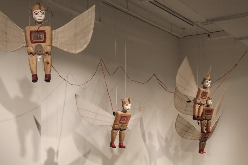
-The purpose of this piece is to see. The angles aren't the typical angels people are used to but instead are more of something from a creepy movie. They are put together in pieces that look robotic as the wings look more bug like. Overall, the angles look very antique-like. Past the objects, one is also supposed to notice the shadows behind. The way the light hits the objects creates multiple shadows which give a more busy look as of there are more flying angels around.
2.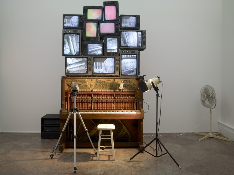
-The purpose of this piece is to see and hear. There are video cameras around the piano as the purpose is to watch it play. Above the piano are TVs stacked strategically on top of each other which feature the piano keys of the piano. This makes the viewer watch and focus on what makes the sound. The exhibit gives a sort of retro feel.
3.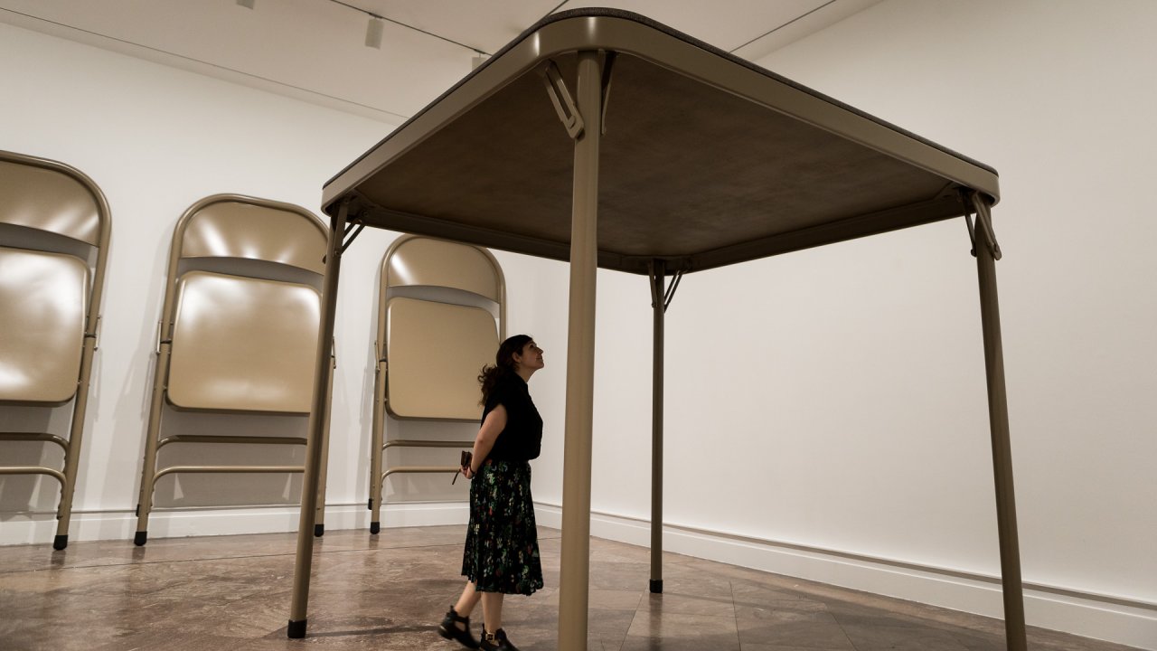
-The purpose of this piece is to use sight.
What did you think of visiting the Gallery and purposefully looking at the exhibition from a different perspective - the physical space, the architecture, theme, etc.?
1. What is the title of the exhibit?
-Out of Sight! Art of the Senses
2. What is the theme of the exhibition?
-The theme of the exhibit focuses on viewing, listening, smell, touch, and taste.
Step 2: The Gallery
1. What type of lighting is used?
-The lighting focuses on the artwork. In some exhibits it adds to the purpose of the work such as Bidadari (Flying Angels) where it creates shadows of the figures on the wall.
2. What colors are used on the walls?
-White is the main color. It's used to focus on the artwork rather than take away the appearance.
3. What materials are used in the interior architecture of the space?
-There are a variety of materials used such fabric, steel, textile, flowers, metal, fiberglass, paint, bamboo, and more.
4. How is the movement of the viewer through the gallery space?
-The movement is based in the artwork. It makes you look and use your senses a lot and find details.
Step 3: The Artwork
-Each artwork has it's own area. This is too stimulate the purpose of the exhibit; using your senses.
-2. How are the artworks similar?
-They each are meant for you to use your senses.
3. How are the artworks different?
-Although they are similar in that you must use your senses, different artworks encourage you to use certain senses depending on the piece.
4. How are the artworks framed?
-The artwork isn't really framed. Because it deals with your senses, it's more based on the space provided to support the work.
5. How are the artworks identified and labeled?
-The artwork is easily identified. Some describe the artwork easier like Piano Piece which suggests sound but there are other senses like seeing.
6. What is the proximity of the artwork to each other?
Step 4: Art Criticism Exercise
1.
-The purpose of this piece is to see. The angles aren't the typical angels people are used to but instead are more of something from a creepy movie. They are put together in pieces that look robotic as the wings look more bug like. Overall, the angles look very antique-like. Past the objects, one is also supposed to notice the shadows behind. The way the light hits the objects creates multiple shadows which give a more busy look as of there are more flying angels around.
2.
-The purpose of this piece is to see and hear. There are video cameras around the piano as the purpose is to watch it play. Above the piano are TVs stacked strategically on top of each other which feature the piano keys of the piano. This makes the viewer watch and focus on what makes the sound. The exhibit gives a sort of retro feel.
3.
-The purpose of this piece is to use sight.
What did you think of visiting the Gallery and purposefully looking at the exhibition from a different perspective - the physical space, the architecture, theme, etc.?


Comments
Post a Comment